Köh
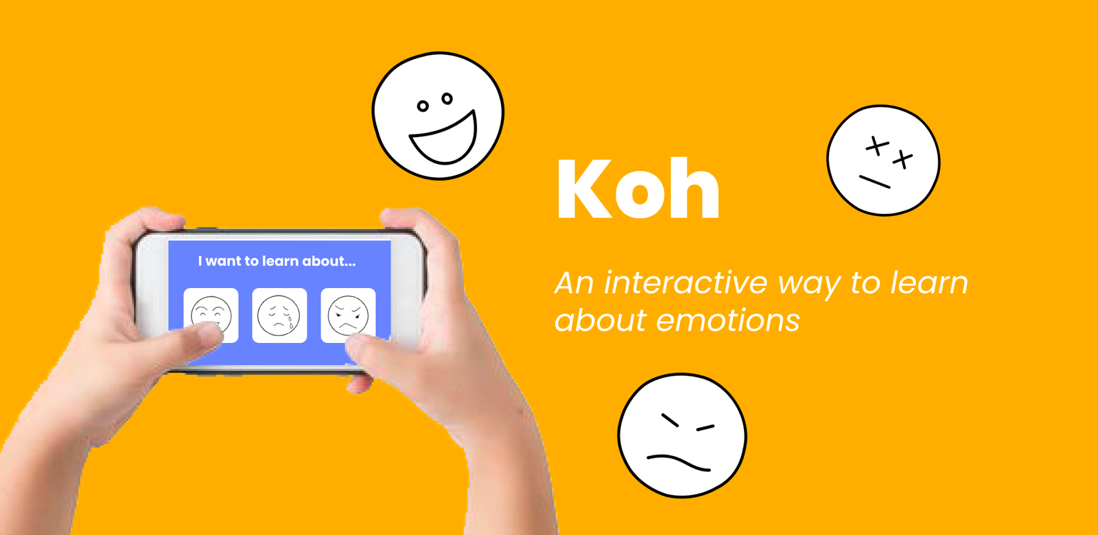
Koh was a group project (4 people total) I did for my HCI class. We wanted to focus on using technology that would help enable those that are disabled. The Koh project is a mobile application that helps young kids on the autism spectrum become more familiar with different emotions and learn to read them better so that they can better communicate with their peers. I was in charge of the back end portion of the app and split the design work with a teammate.
Design Process
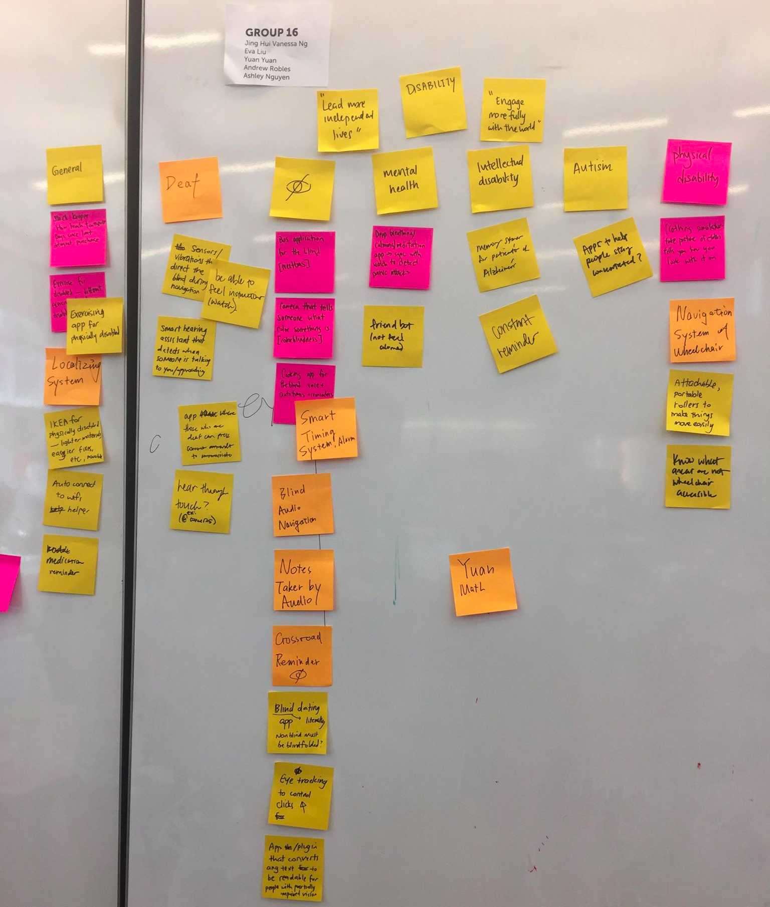
Ideas during ACCESS+ABILITY brainstorm
As a team, we collectively thought of many ideas that revolved around the idea of benefiting those who have disabilities. We then narrowed these 50+ ideas down to 3 based on these criteria: “novelty”, ideas that interested us, and feasibility.
With this opportunity to explore how to use the intersection between technology and society, we chose “Game to help identify facial expressions”. We chose this as one of our final 3 ideas because it was a novel yet fitting approach to help individuals with autism understand something incredibly important. In addition, It was one of the more feasible, “novel” ideas. The idea received good feedback and most importantly, this idea excited our team the most.
Personas
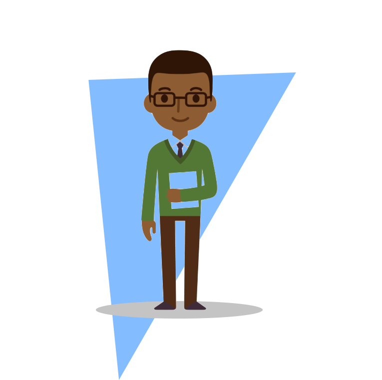
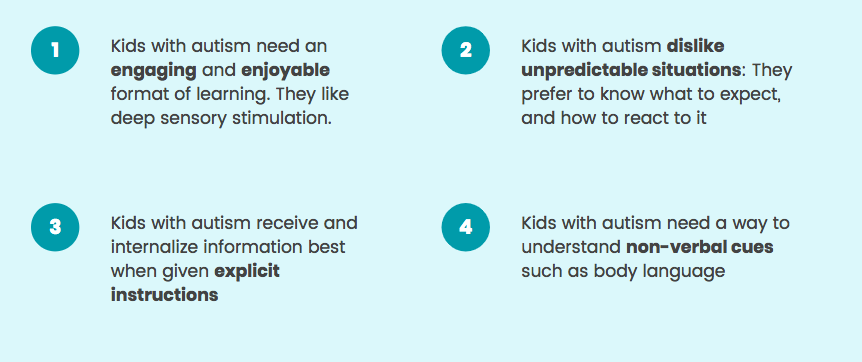
After conducting some interviews with individuals with autism and individuals that deal with autistic kids (teachers, parents, etc) we came up with these 2 personas based on the interviewees pain points and needs.
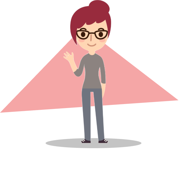
Here is Audrey. She is a school teacher who is has a few students on the autism spectrum. She notices that these particular students have a hard time communicating with others and therefore notices they don’t have as many friends as the others. She wants her students to be able to make friends with others.
Here is Ky. He is a child with autism. Ky finds it difficult to interact with othersbecause he can’t read others’ emotions correctly. He wants to be able to better communicate with others.
Some other insights we gained from the user studies were:
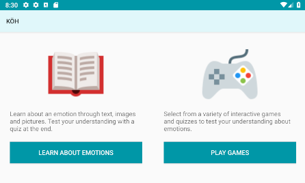
Even at the early stage, our app could be broken down easily into 2 aspects:
- Learning about emotions
- Games and quizzes to test the user’s understanding about emotions
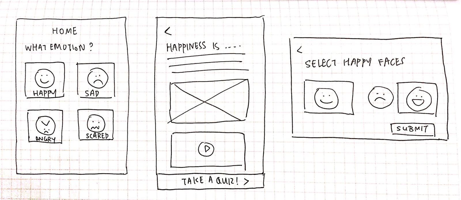
Portrait + Landscape mode sketch
Above is one of our first iterations of sketches. We sketched out 3 main screens:
- A screen to allow users to select from various emotions
- A screen with scrolling with the respective text, photo and video content about an emotion
- A landscape mode quiz
Feedback
| What we learnt through user feedback by showing them the above preliminary sketches | > | How we iterated our designs based on the user feedback |
|---|---|---|
| It may be inconvenientfor the user, especially a kid, to switch between portrait mode (for content) and landscape mode (for games) | > | We decided to make our app portrait mode entirely. We observed through 2 users interviewees (who were kids) that this is the most comfortable way to interact on mobile devices, especially games. |
| This flow may be restrictive. The only thing a user can do each time they open the app is to select an emotion, go through its learning content, and then take the quiz. What if the user doesn’t want to take the quiz after the content? What if the user just wants to play games? | > | We added a home page which provided the user 2 options — To learn about emotions or to play games right away. |
| It is painful to scroll through so much content | > | We sectioned the content into 3 short screens (that did not require scrolling). This also helps categorise the information better and all the user has to do is click through, rather than continuously scroll. |
Based on the above feedback, we made new changes to the sketches.
High Fidelity Prototyping
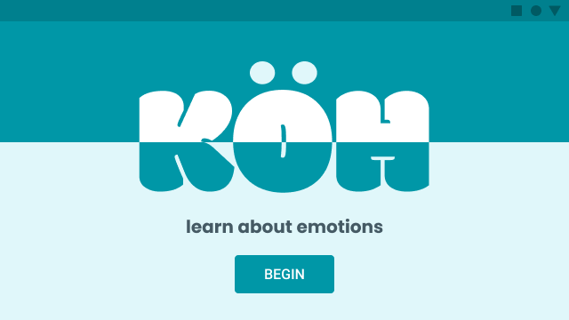
Splash/start screen
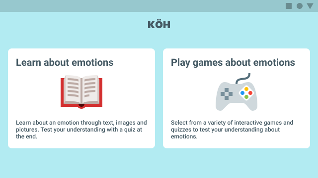
Home screen of KÖH. User can select from 2 options. In this case, we select “Learn more about emotions”
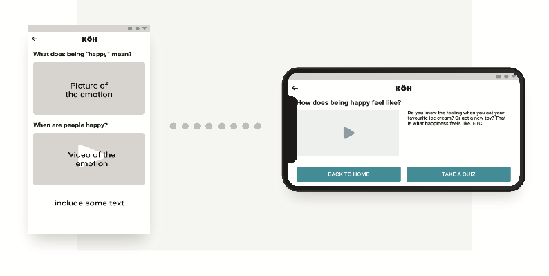
Task 1: Learning about an emotion
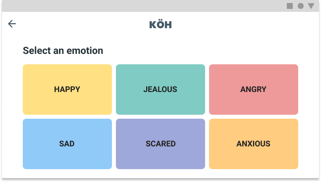
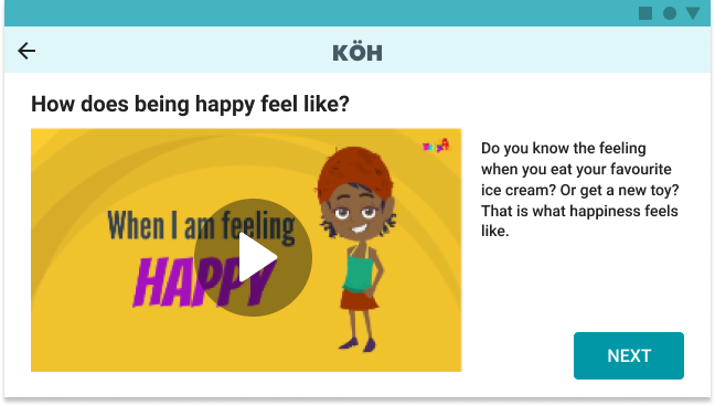
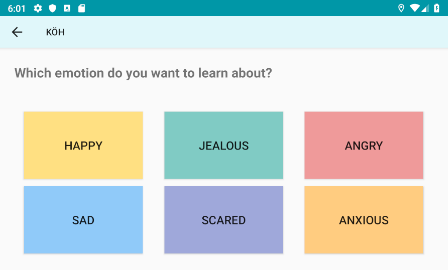
Screen displaying a catalog of emotions. User can select any one of them to learn more. In this case, we select “Happy”.
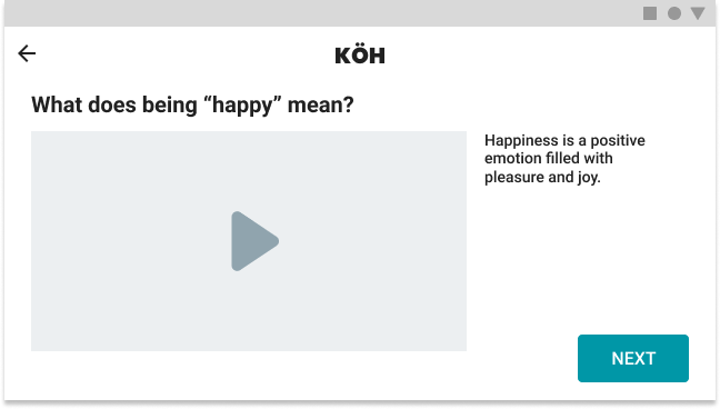
User is presented with various multi-media content (text/images/videos) to learn about happiness.
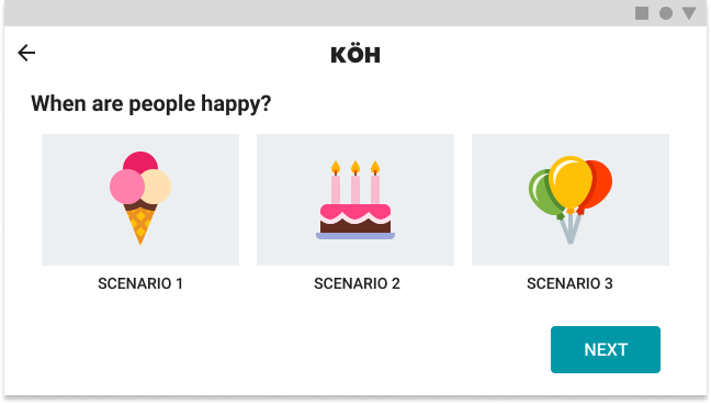
Users can visualize different scenarios the emotion is used in.
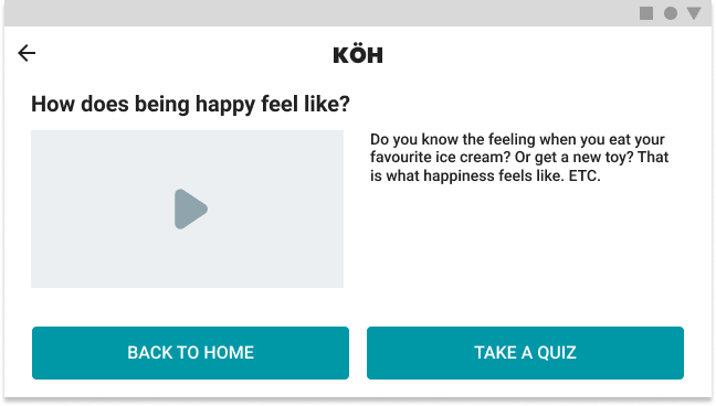
Once user has read through all the content, they can go back to the home screen or take a quiz to evaluate their understanding. In this case, we take a quiz.
Task 2: Taking a quiz about an emotion
The quiz comprises of some interactive activities to evaluate the user’s understanding of the emotion they just learnt about.
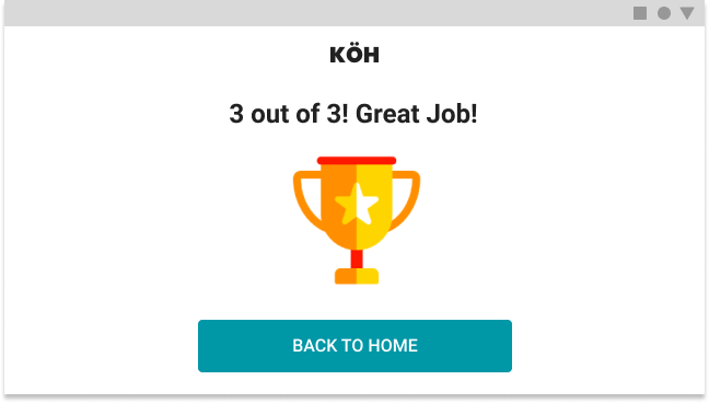
After user has completed the quiz, a summary of their score and encouraging message is presented.
This is the home screen. The user can select from 2 options. In this case, we select “Learn about emotions”
Task 3: Playing a game about emotions
From the home screen, if player clicks “Play games about emotions”, they arrive at this screen. They can swipe left and right to browse through various games.
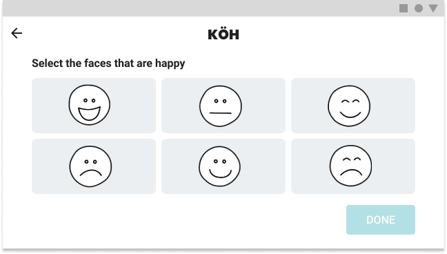
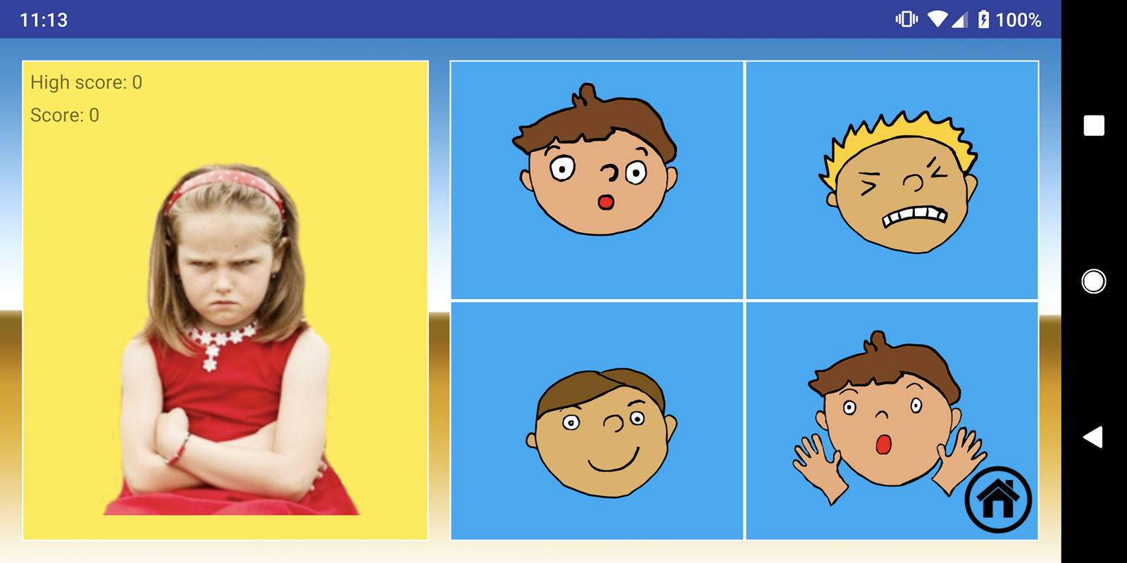
In this game, the user has to match faces with emotions.
Comparative Analysis
An important part of the process we wanted to make sure we didn’t overlook was our competitors. This was important to us because although we had a great idea we needed to notice there were a lot of similar apps that existed. In this part of the project, we looked at how other apps were achieving the universal motive (how to help kids with autism), what we liked, what doesn’t work for their app, and how were we going to make our app different from theirs.
App 1: Emotions, Feelings and Expressions!
Target User Group:
The target users for this app are kids who have issues understanding emotion and different facial expressions or needs.
Functionality
The goals of the app was to help kids understand their feelings as well as the feelings of others through facial cues, situational cues, and object cues. Our proposed idea is similar to this, but ours also includes videos and other explanations as opposed to just cartoons and images.
Usability
The app included a lot of advertisements, which may make users frustrated because this causes a break in the work flow of the users as they go through the app. In addition, the workflow of the app is not very clear in some of the activities. We can make a clear workflow with less options and strange click/swipe functionalities within the application.
App 2: Autimo - Discover emotions
Target User Group:
The target users are kids who have trouble understanding and knowing what different emotions look like. This matches our target user group
Functionality
The user is able to chose different emotions and see images and videos pertaining to each of the six different emotions. Users can also play games to check their learning and look at the progress of their learning. Our proposed idea is similar to this, but we plan to include more emotions and content pertaining to the emotions.
Usability
The functionality is a bit limited since there are only six emotions and a lot of the activities are paid features that I cannot get access to. We plan to improve these features by adding additional emotions as well as games that can easily be accessible to the users.
Our App, How it is different
A lot of these applications have features that are related to emotions, but do not give the user much content in relation to the different emotions. Granted, a lot of these apps also cater to other learning disabilities and do not go too deeply into each of the features or activities in relation to understanding emotions. Many of the applications also cater to the parents so they can see the progress that their kids are making in learning through these applications, which we do not plan to focus on in our application. While many of the applications cover the various emotions through facial expressions, they do not elaborate how exactly one might feel when experiencing these emotions. These applications also do not provide tips on how one might cope when experiencing such emotions. Hence we hope to help kids learn about emotions beyond facial expressions through various media types other than images. In addition, we will provide explicit tips on how to cope with negative emotions.
Final Design
This is the home screen. The user can select from 2 options. In this case, we select “Learn about emotions”
This screen displays a catalog of emotions. The user can select any one of them to learn more.
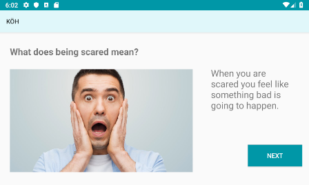
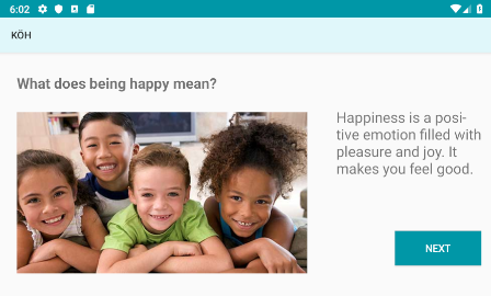
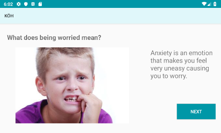
The user is first presented with a basic definition of the emotion. A photo accompanies it to demonstrate how happiness looks like.
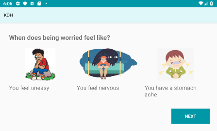
The user is presented with short and simple explanations of how an emotion feels like, accompanied with fun graphics.
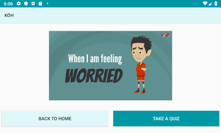
Finally, the user can watch a video that talks more about the emotion. After watching the video, the user may choose to go back to the home screen, or take a quiz to evaluate their understanding about the emotion.
Task 2: Playing a game about emotions
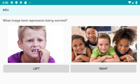
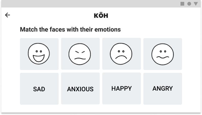
Clicking on the quiz takes the user to this screen. For the next three screens, they are asked to select the image that represents the emotion they just learnt about.
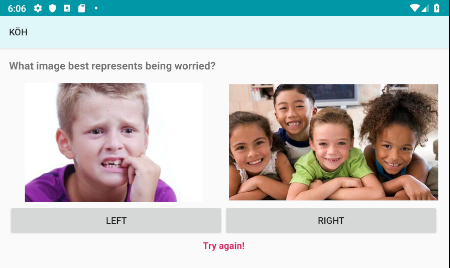
If the user happens to select the wrong option (in this case, the option on the right), we display an encouraging message, “try again!”.
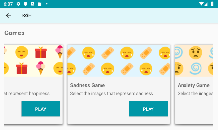
Clicking on “Play more games” takes the user to a games catalog. They may access various games and quizzes to test their understanding about emotions. This screen may also be reached by clicking “Play games” from the home screen. Clicking the back button in the top left corner takes the user back to the home screen.
Technical Challenges
Though this app was not projected to be a technically challenging project to code, we ran into difficult design decisions that would change the user experience for the better. In addition, we ran into some coding challenges because we wanted to make the code more streamlined.
Game Catalog Layout Change
From the sketches to the final wire frame, one can see the layout of the game catalog changed. In the first iteration, we designed a catalog the user would have to swipe through different “cards” to view the different games. Although this design was visually pleasing and a more modern design, we needed to think about the users’ needs first. We started to ask questions like would this design be easy for our users to use? Is it confusing? How would they know to swipe? After truthfully answering these questions, we made the decision to make a horizontal carousel. This was intuitively easier for the user to navigate to the different games available.
Templates for Activities
Because we had so many emotions in our app, it wasn’t a reasonable choice to make a separate Activity for each emotion. In order to cut down the amount of work we would have to do, we looked into ways we can make a template for the Activites that were going to be shared between emotions. Based on the emotion the user chose, the content, pictures, and videos were being pulled from our resource folder. Although it took a little time to fix bugs when using this method, it definitely saved time rather than having to hard code everything in. In addition, this helps with future updates we might make such as changing/adding/deleting emotions because all we need to do is add the necessary content (pics, videos, and wording) into the appropriate locations instead of creating an additional Activity.
Padding and Margins
In the first prototype, we noticed that the padding and layout was not universal across the platforms. In some of the Activities, the contents on the page were not centered meaning the top/bottom/left/right padding or margins were not the same. This was also reflected in how we were coding the different activities. For some, the contents were put in a LinearLayout so the contents were center aligned. For others, the contents were aligned based on constraints. This had rules for padding that put the content all over the place without any rules. Making a change was necessary because the app would look cleaner and more uniformed. There were also some cases where sentences or pictures were getting cut off. As a result, we made the decision to use the LinearLayout throughout the app. In addition, we needed to make the padding the same across the app. This included the padding top/left/bottom/right for each (text/image/video)view in the layout.
Layout
Initially, we had a vertical layout. After conducting interviews and feedback, we made the decision to change the orientation to horizontal. The advantage of this was the ease for the users who were holding it like a game console. This also removed the act of scrolling to view content which might not be obvious to our users. As a result, we also needed to change the placement of certain objects such as content and buttons.
Design Orientation Evolution
GitHub
Lastly, a big issue we were having was after pulling the code to the GitHub repo. There were issues with the gradles but after researching on Google. We found this was a simple fix by “cleaning” the project and syncing the project with gradle files.