Rising Tides
The Artic Institute
Rising Tides is a volunteer matching program the Arctic Institute wanted to work on with Cal Blueprint. The Arctic Institute is a nonprofit headquartered in Washington DC. Their goal is to help the complex issues facing the Arctic security. They plan to solve these problems through rigorous research that may help them come closer to the solution. In this group, we worked alongside a representative from Arctic and within the group of 5 on my team I am in charge of the design and the front-end portion of the app.
Because Rising Tides is a branching program of the already existing Arctic Institute I wanted to make the website of Rising Tides look visually similar to that of Arctic. The reason for this was because I wanted to keep some consistency in the design between program and nonprofit. Here is what the Arctic Institute website looked like.
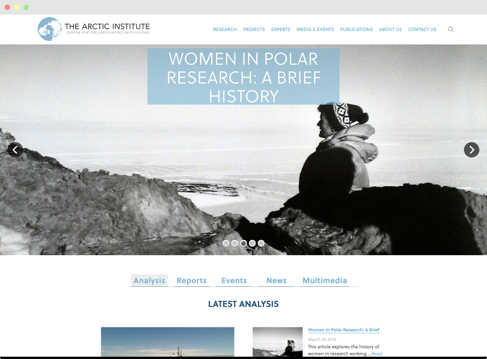
thearcticinstitute.org
Before starting on the design of the app, I first identify the user of the website. Some potential users are volunteers and nonprofit organization leaders.
Here is John. John is a volunteer that is

Brandon is the representative of a nonprofit. He wants an easy and streamline way of publicizing projects others can look into and apply for. In addition, he wants an organized view that’ll make it easy to see a list of application and projects.
The First Iteration
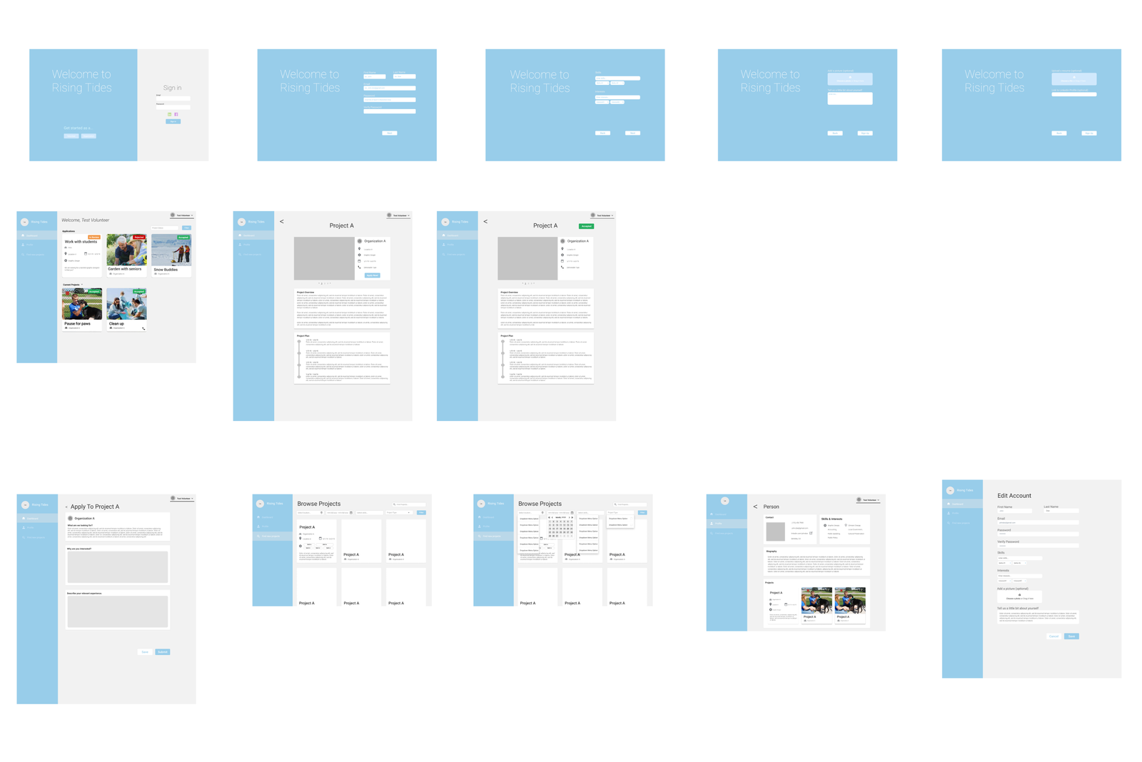
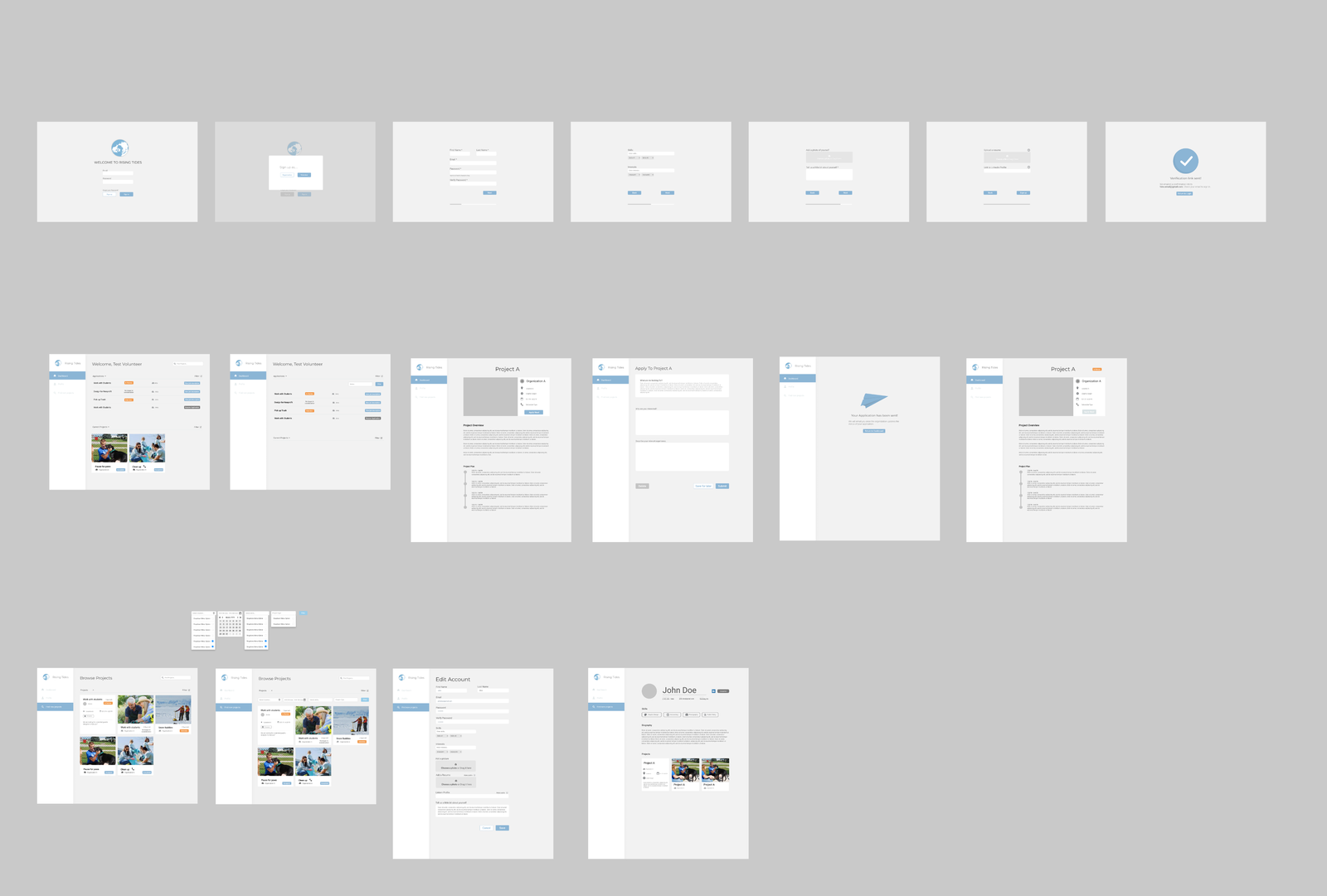
1st iteration of Rising Tides
Above is the view of the first iteration of the Rising Tides website. Rising Tides provides a platform for volunteers to connect with organizations in charge of helping different communities (specifically located in the Arctic) that have been affected by climate change. As a team, we collectively thought it would be best to represent the website as a dashboard with a fixed sidebar. The reasoning behind this is with the sidebar it is easier for the user to navigate between pages. In addition, the dashboard view shows the most important information. The information is consolidated and arranged on a single screen so that at a glance specific information can be monitored. This helps the volunteers track the status of their applications and organizations to easily view applications and current projects.
In this initial design, we have a good start in what content we wanted to be on the page and what base colors we were going to use. However in this first iteration, I feel as though I overused the blue. In some cases it complements well in other cases not so much. An example of when the blue was not a good choice, was looking at the color contrast in the registration phase.
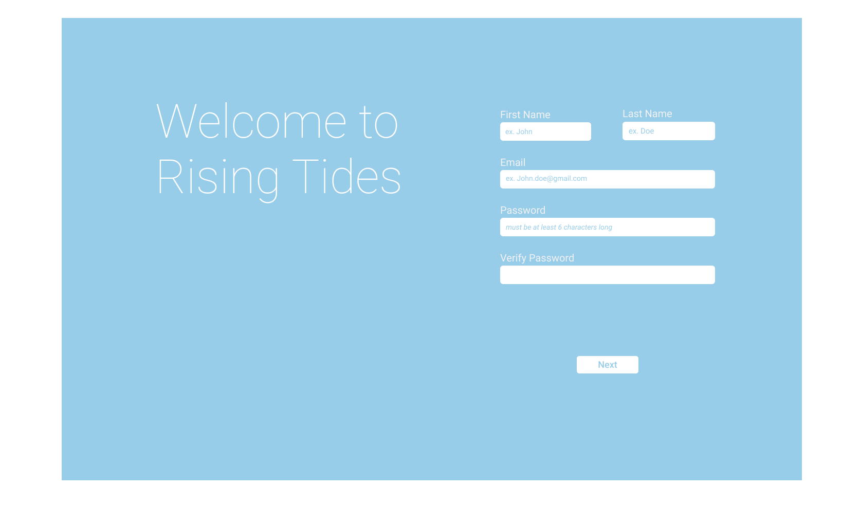
registration
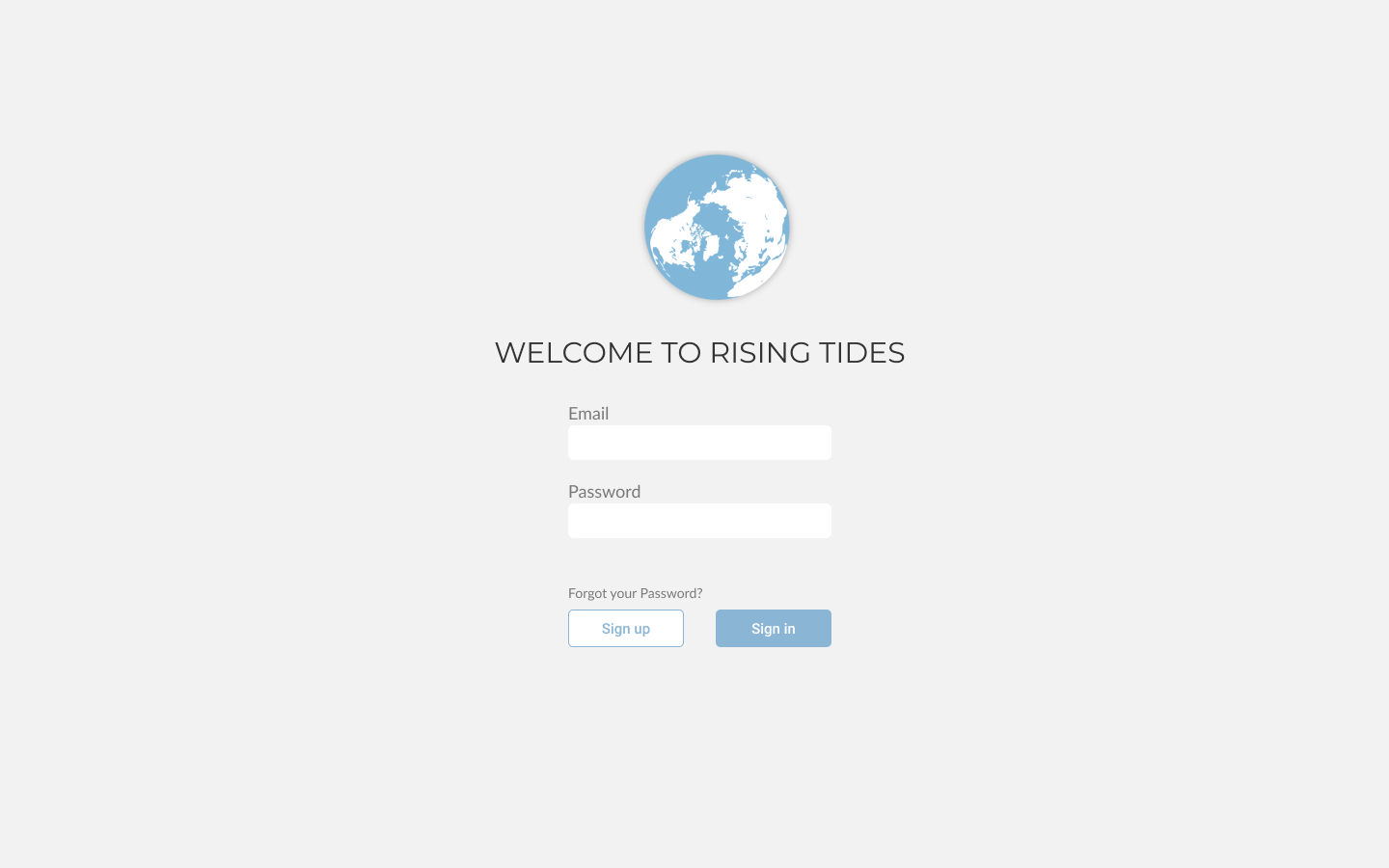
In this first iteration of the registration page there is not enough contrast to distinguish the words from the background. Even in the white box is can be hard to read the light blue on the white background. I wanted to be conscious of the visually disabled and to be honest even with the normal eye because even I had a hard time reading the pages.
In addition, another problem we ran into was inconsistency with padding. There were a few pages that seemed appropriate to change the padding but for that case there should only be a few distinct layouts. In our case we had more than a few and almost every page had its own distinct layout. Below is an example of the different layout that should be similar. The one on the left is centered but the application page (right) was left aligned. In addition, the arrows and the title of the pages have different sizes and locations.
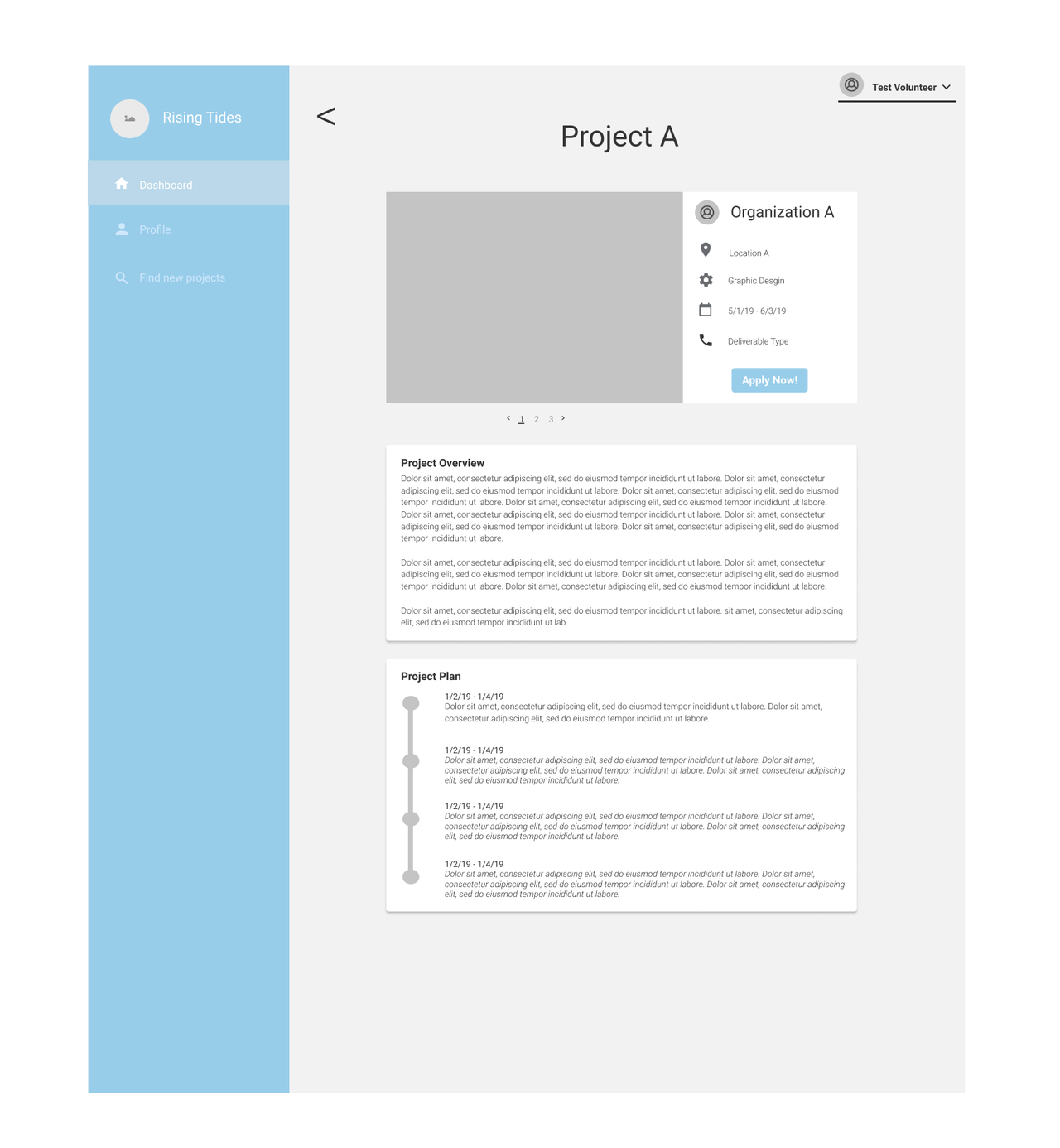
project page
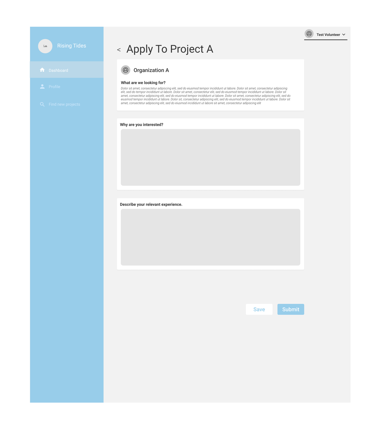
application for projects
Going through the prototype we also found that there were features we were missing such as a confirmation page, different styles we wanted to experiment with, and content we wanted to add.
Overall, this was a good start because we were able to see what simple yet important features we needed to include and kept in mind good design style we had from this first iteration such as accents and the flow of the app.
The Second Iteration
2nd iteration of Rising Tides
In this second iteration, I came up with a different look but still kept most of the content the same. I went over the issues we discovered in the first iteration and redid the major flaws we had.
In this second iteration, I redid the welcome page and made it look concise and simpler. I changed the background from blue to gray, I made the font of the welcome text smaller, and added the accents we liked from the original.
login/welcome page
On the dashboard page, I take away the boxes for the application portion and instead make it a list of applied/saved projects. Not only does this minimize the use of space but it takes away the unnecessary information after you’ve applied and already know what the project is about. After the volunteer has applied I figured their only concern is the status of the application. If the volunteer wanted to look at the pictures or text to remind themselves of the project they can always click on the project to get more information.
In addition to the change of the application portion, I make the padding and the title text consistent throughout the website. This makes the website seem less scattered and cleans up the layout as well.
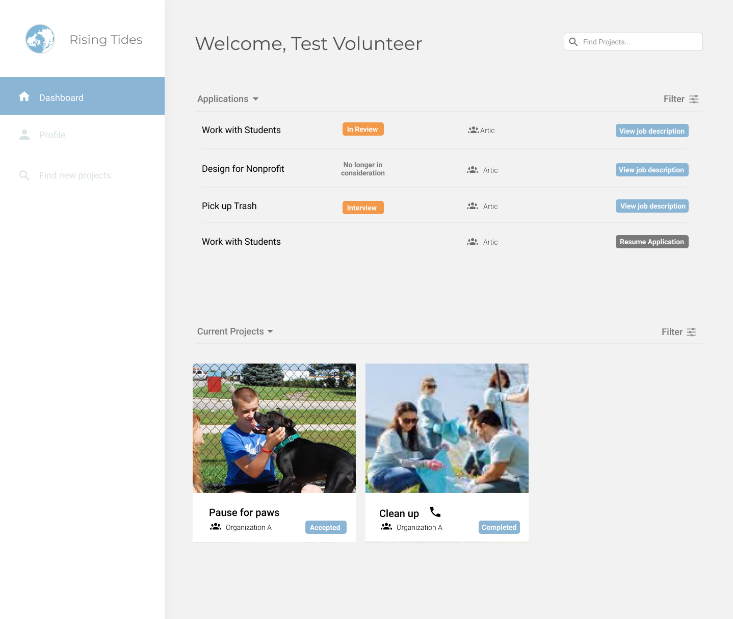
dashboard
From the first iteration, I found that a successful page was necessary after submitting an application of registering. So I added 2 new pages that helped with this. This is important because we don’t want the user wondering if the action they just took was successful. We also want to avoid the user from redoing what they did because not only will that be confusing for the user but on the backend it will get messy if we have multiple inserts of the same information.
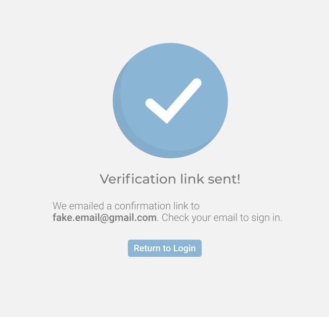
confirmation for registration success
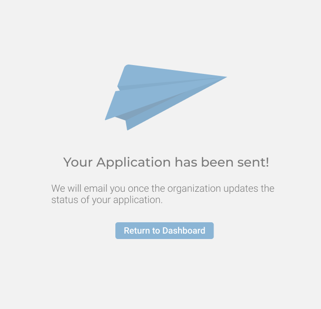
confirmation for application success
Although this project is not done yet, we are continuing to catch small bugs to our design. In the meantime, we are starting to code the initial front end of the project to make progress while finalizing smaller details on the design.