Bungee
What is Bungee(Tech)?
Bungee is a start-up that created an API that would fulfill crawl requests on a much larger scale than any current service would provide all while maintaining a near perfect crawling success rate. What makes us different:
- a successful crawl rate of 99.9%
- the ability to crawl Geo-specific data
- latency 40% faster than current solutions
- zero setup cost
Bungee helps these businesses reduce operational costs, dispose of overhead management, and organize all data in an inclusive package for any and all needs. With Bungee, companies don’t need as much manpower when sorting through their data.
Bungee also includes a dashboard that give users deep performance and system metrics about current crawls, success and failure rates, location-based crawls, and an overall scope on how the API is functioning. This makes it easy to track progress and visualize the functions of the software.
What was my project?
While apart of the Bungee team, I worked on rebuilding the landing page. Prior to joining the team, I noticed it was difficult to understand what service the company provided. Given you’d probably need to be actively looking for this type of service, as an outsider, the original website did not make sense. In addition, the graphics were unrelated to the company, making it even more confusing. My mission for recreating the website was to make the website clearer for those who visit the website for the first time. In addition, I wanted to jump start the beginning of an identity for the team as well.
Some difficulties when starting this project was the lack of knowledge in web development. Prior to this experience, I made a very basic web app during a hackathon. This was my first time creating a web app so you can imagine how little I was able to learn in the 36 hours I had to create a website. In addition, of any process when designing a web app until after I took a HCI class the following fall semester.
The Beginning...
Before starting anything, I really wanted to understand who I was creating this website for. After talking to the product manager and CPO, who knew the clients more, I created personas for 3 potential clients: Vice Presidents of Technology of a company, investors, and coders.
Here is Joe. He is a Vice President of Technology at a big enterprise, Company A, and is looking for an efficient way for Company A to collect mass data. He has a technical background and also is interested in how well the service will integrate with the current technology Company A is using.
Here is Mike. He is a software engineer who is working on a small side project. He wants to scrape a certain website but has been unsuccessful with most services. Since Mike is technically savvy, he is curious about what coding languages the API supports.


Here is Sarah. She is an investor that is trying to find cool companies she feels secure making a capital commitment to. Sarah’s is solely looking at the future and if there will be a financial return on this investment. In addition, Sarah is not technologically savvy. Some of the questions she would ask are: Is this product revolutionary to the field, what phase is the company at currently?
Brainstorming...
As I am brainstorming, one thing I looked into are competitors. What do the competitors’ websites look like? What information do they have on their websites? What information is important to have that may be transferrable to our website? How do I make our website different? Visually, what makes a website appealing?
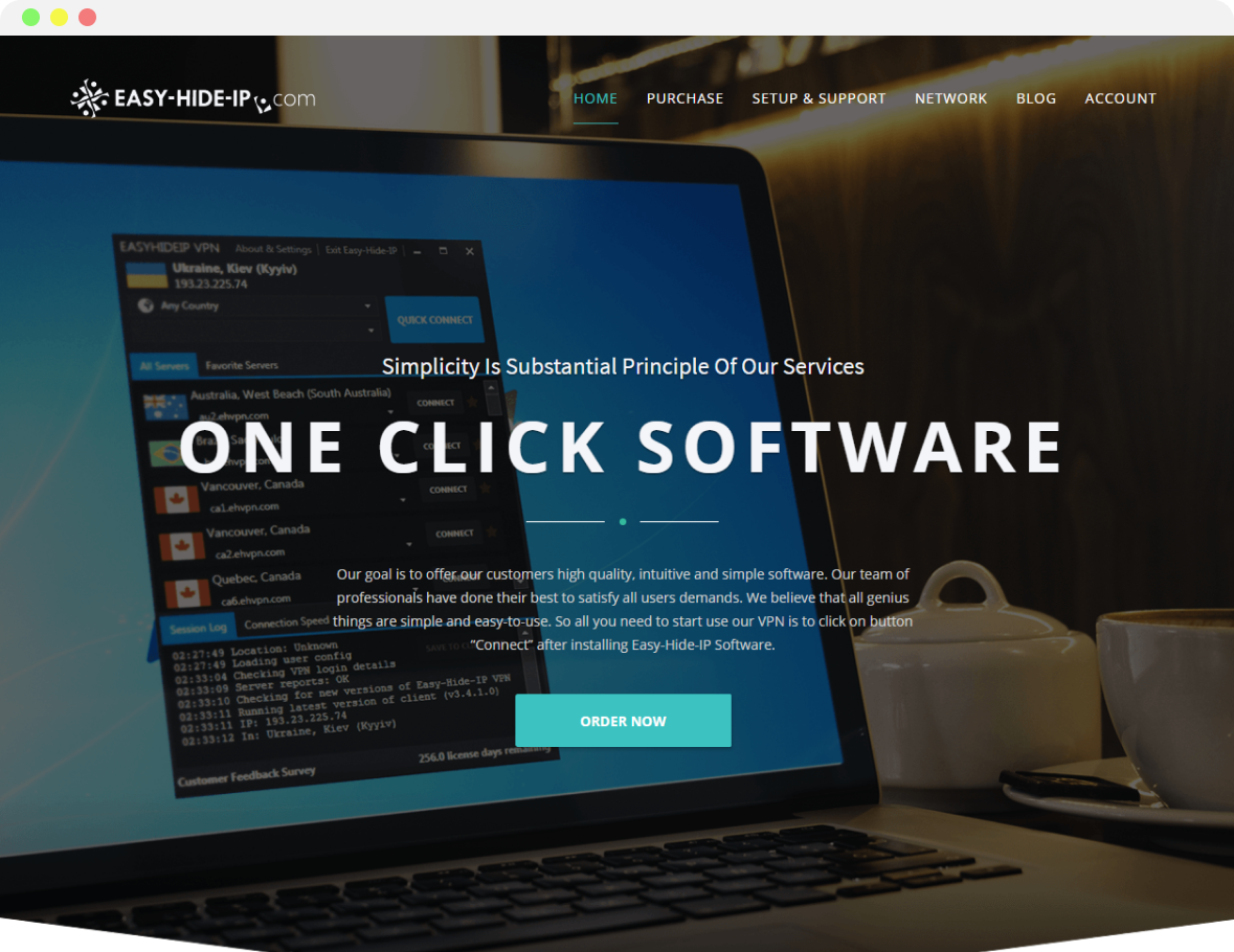
easy-hide-ip.com
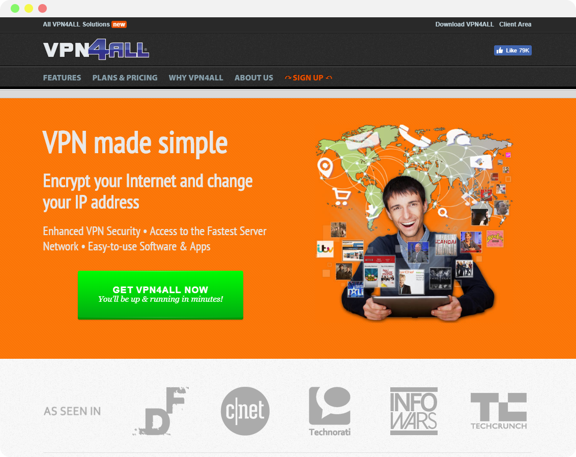
vpn4all.com
The look of the first 2 websites are examples I wanted to avoid. These look outdated and out of touch with today’s design.
The one on the right, has a logo that is a big give away for me. In addition, seems out of place and not well designed (the color contrast makes it hard for the user to read the the text at a first glance. In addition, another group of users that should be considered are those with visual impairments).
Easy-hide-ip.com has a template vibe and I say this because there is no identity to the page. If you review the page photos there is nothing that really distinguishes them from other companies. The photos together don’t compliment what the company does. From this website I wanted to make sure that each component I made or put into the website was relevant to what the company does.
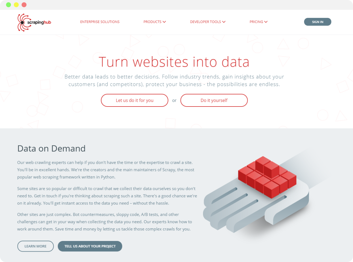
scrapinghub.com
ScrapingHub.com is a website that was more on the corporate side. When looking at the overall design of this website there were good things I noticed such as the formality of a corporate website. However, one thing I wanted to avoid was using too many words. When browsing a website, I, as a user, would want to be able to skim the text quickly.
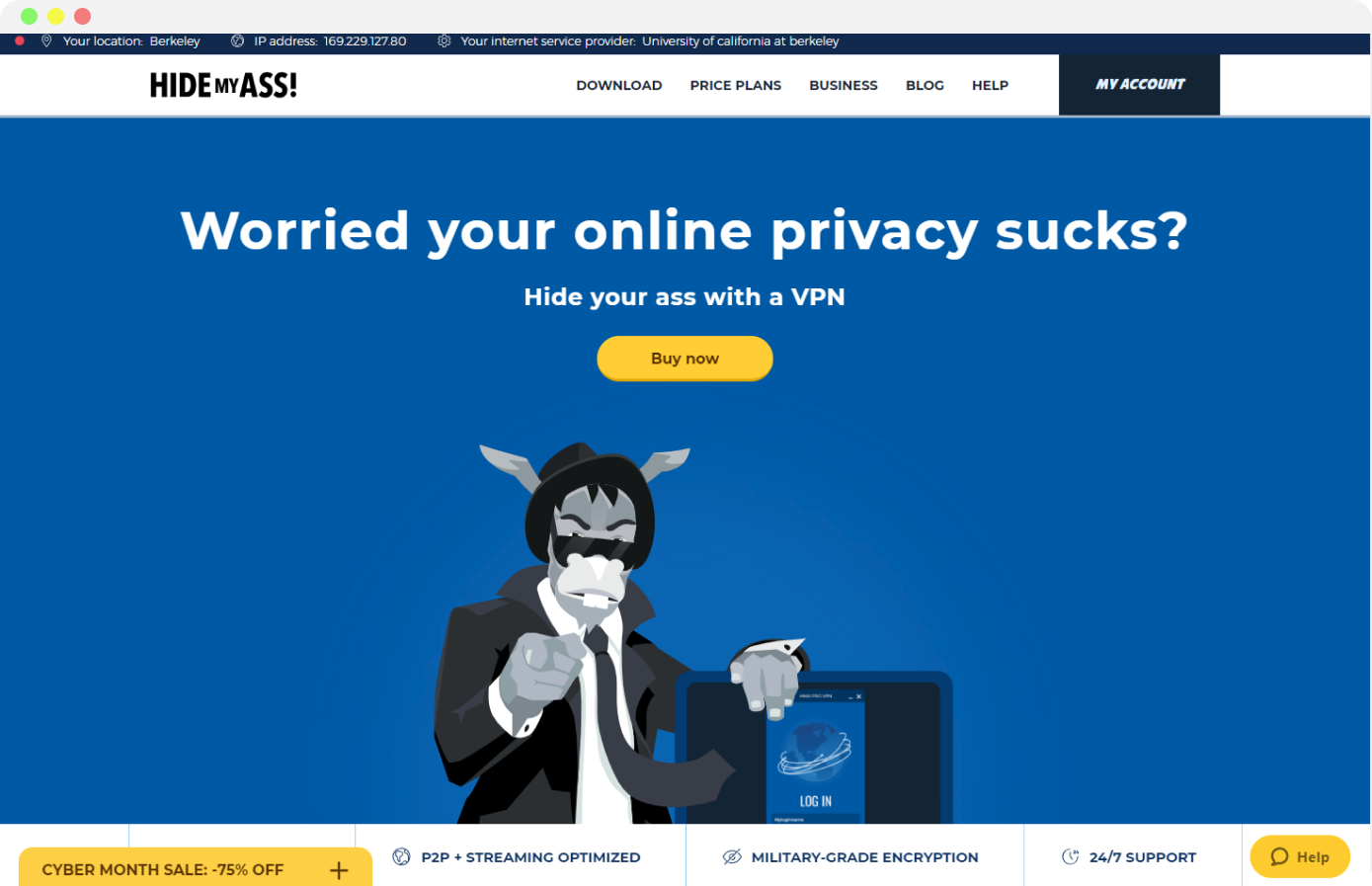
hidemyass.com
Hidemyass.com is a website that I admired because it has a main character. Specifically, the website has a mascot that is incorporated into the graphics that helps explain the concept of their product. This gave me a lot of ideas on how people may better understand through the medium of pictures rather than words. So although this had cartoon aspect to the website, it was very memorable because not only can people distinguish this website as the website with the donkey on it but it also helps with understanding the different features.
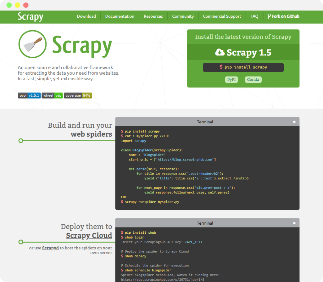
scrapy.org
Scrapy.org is an open source of the most basic solution to scraping websites. Taking this into consideration, the information is relevant to Bungee but it is also relevant to all other companies. This provides the most basic features of scraping a website which doesn’t help distinguish Bungee from other companies. On the other hand, scrapy.org does have a soft pastel color palette that I wanted to use on the website I created.
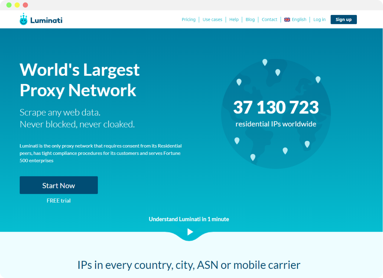
luminati.io
So now I have an idea of how I want to create graphics and I know what type of color palette I want to use. Above is an example of a website I admired because they put these 2 things together very nicely. The overall design of this website is very consistent and cohesive. Although there is not much variety in colors, I enjoy there is very little variety in colors. Overall Luminati.io has a nice design. The colors are coherent. The typography varies when need be and all parts of this the website is relevant to what the company does.
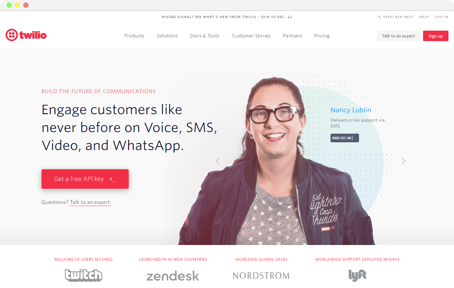
twilio.com
In addition to the competitors, another website I considered is Twilio.com. In addition to having a nice design, Twilio.com was also a good resource for how to communicate what the api does and how it works.
Considering all the websites, the competitors and Twilio, I constructed a spectrum where one side was a very formal corporate design like ScrapingHub.com and on the other side a more friendly and cartoonish design like hidemyass.com. Considering what design was more memorable when looking at competitors and inspirations, I remembered the more friendly designs which made it easier to understand. However, considering we were providing a service to other businesses I wanted to preserve a little bit of the corporate design as well. So I wanted the BungeeTech website to fall somewhere in the middle of the spectrum where it was easy to learn, memorable, and business formal.
Execution
Before starting anything, I started with the logo. Below is the first iteration of the logo when I first joined the team. This was something they put together and there are some flaws when looking at it at the first glance.
Bungee 1.0
The ‘B’ logo is not the perfect logo. If you look very closely at the half circles of the logo it is not perfectly round. Although this is something I wanted to change there were things I needed to keep in mind. For instance, the change of the logo can’t be drastic because we want the old users to be surprised. In addition, we don’t want to avoid any possible confusion from drastically different designs.
Bungee experiment #1
Here we experiment, with a gradient background with white text. This preservers the original logo but the goal was to fix the ‘B’ of the logo and, here, we have the same issue.
Bungee experiment #2
In this experiment, we get rid of the ‘B’ logo and keep the ‘BUNGEE’ part of the logo. In addition, we add a gradient on the ‘BUNGEE.’ Although this is a nice logo if we consider how we would incorporate a logo with a background card onto a website it would not work out as well. In addition, it may be hard to read for so
Bungee 2.0
Finally, we came up with this design because it preserves the signature gradient of the original Bungee logo. We also preserve the ‘BUNGEE’ part of the logo and it’s easy to incorporate it into any design.
First iteration of the website
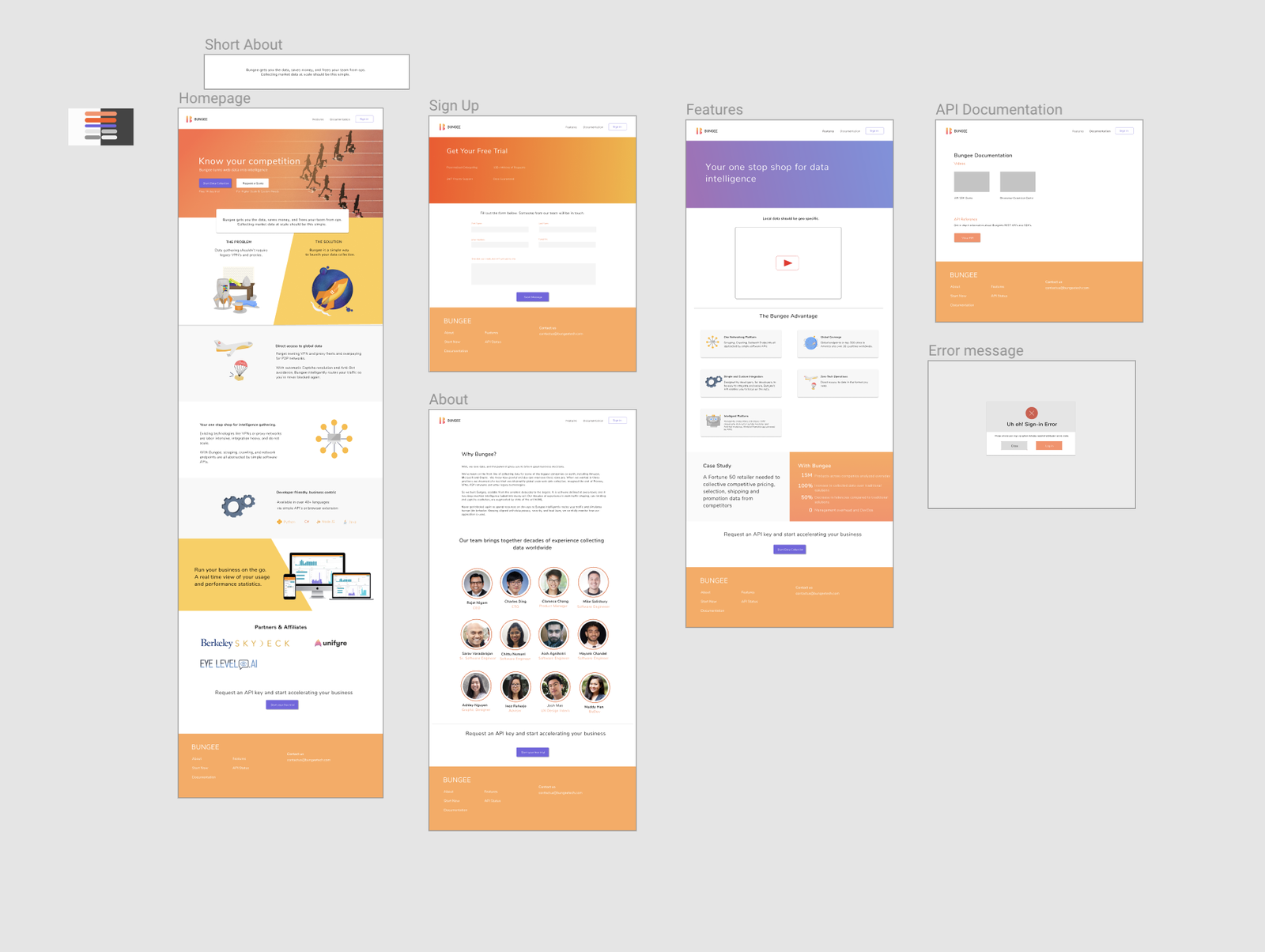
Right off the back, the changes I wanted to make were to the wording of the website. I took this time to find words that would best convey what the company did and what made unique compared to its competitors. In this process I worked closely with the CPO and CTO who created the api and know it like the back of their hand.
When wire-framing, we went through different iterations taking things out that we thought didn’t help with the 2 main motives of the websites: makes more sense and helps highlight the features that makes BungeeTech different.
In this process, I also experiment on making our own library of icons, which are shown below. I took on a cartoon style for the icons which set the tone of the rest of the website.
In addition, I also looked into adding graphics that would give the user a different mode of explanation for the product. This addition was made as an assumption that would help users that learn better through illustrations.
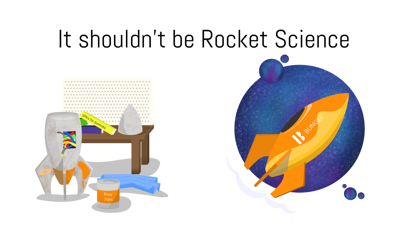
Illustration of the Problem without and the Solution with Bungee
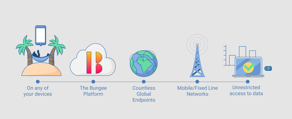
Illustration of how the api fits in a process
Below, is the final look of the website after the first iteration of the website.
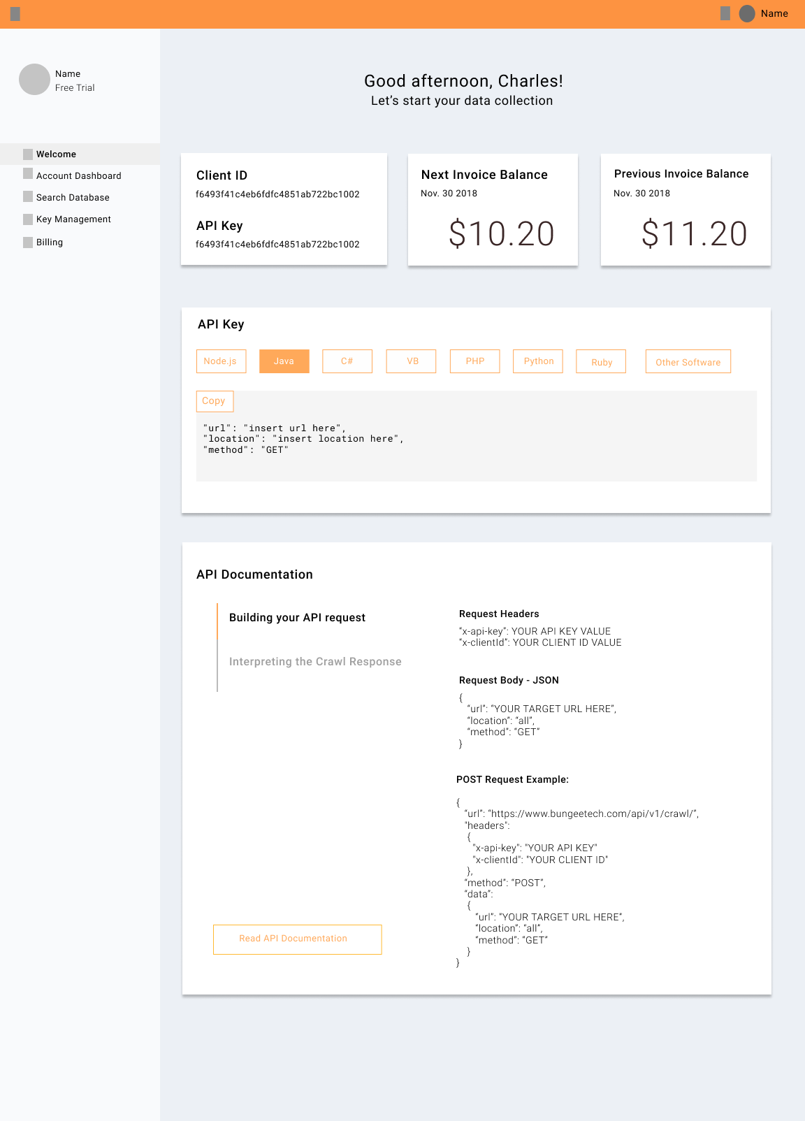
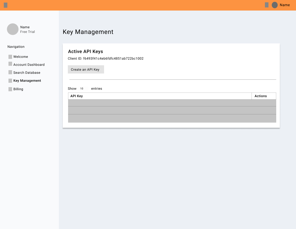
Now that we’ve modernized the landing page, it was important to make this design consistent throughout the company. This included the account dashboard
Critique/Feedback
For the longest time, I looked at the design and knew this was not the style I was going for and could not put my finger on it. The design I had before was unsettling because the cartoon seemed too childish for what I intended. I wanted to keep the cartoons because including illustrations made it easier for most people to understand (Also it added variety to the page). Although there are cartoon graphics, I wanted to preserve the professionality of a corporate website. I discovered by removing the strokes on the original icons made it closer to the ideal style I was going for. Some further fixes I want to make on the icons is using a smaller color palette. I dont want the color library to be too big because it can make the icons seem unrelated/not a part of the same library.
During the first iteration of designing and coding the website, one thing I did not consider was the responsiveness of the website. I was only focused on designing on the desktop version of the website and was embarrassed when realizing investors were probably looking at the website on their phones on the fly during a startup fair we frequently presented at. It was very late in the summer when I discovered this issue and only had 2 weeks to solve it. I utilized flexbox which helped with most of the app and other specific cases I had to do a lot of researching on how to go about fixing the responsiveness. This was an important part of the project because not only were we getting a good amount of traffic through mobile devices but also because it looked unprofessional.
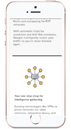
mobile design
After looking at other websites, I noticed another form that communicated the usefulness/how to use the api through a widget for was most helpful for someone new to a product. In Twilio.com, there was a widget that allowed the user to get a very basic experience of how the api works. I came up with prototypes for a mini tutorial on how the api worked in place of the video the original website had. In addition, I planned on including a widget that showed how in different coding languages the api used when it looked so not only will the potential customers know which languages were included in the api but be able to physically see as well.
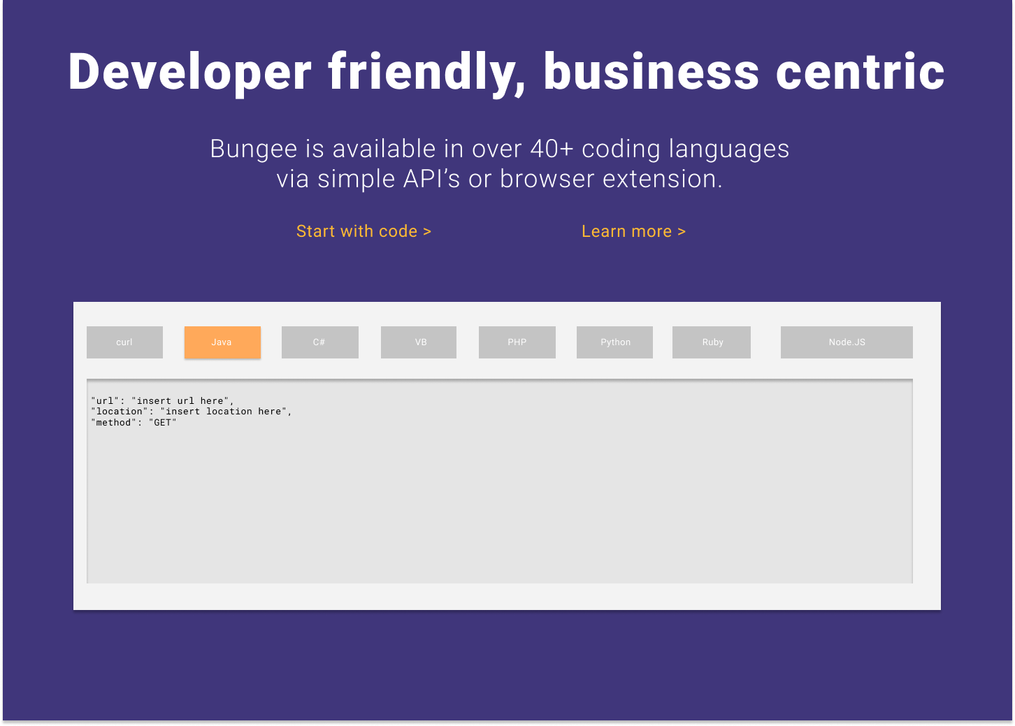
api in different languages widget
Other additional changes we wanted to make that weren’t pressing we continuous change to the wording of the website. It always felt like we could better word the information and make some information more concise or be able to expand upon. Lastly, there seems to be a clash of real life photos and cartoons which are very different types of design choices. Being able to keep it consistent and choose one design is another change we are looking into.
Takeaways
This being the first design project I’ve had I learned that there is a lot more than just designing you have to think about. There are limitations/cases you have to think about because we are working with technology. One example is the responsiveness of the website when visiting it on multiple devices. For example, the layout of the website might not work out on a mobile device. Consistency is another design rule I learned to keep in mind. It is nice when there is an update to a part of a product. However, as a designer, it is important that the design is consistent throughout the product as well. This included colors, typography, layout, etc. While working on this project, my main case was to create a website that best communicated what the company provided and how it differentiates to its competitors. However, in the process, I’ve developed the first stage of a brand identity. I felt that it was important for the company to have something it can be remembered for.
As we continue to make little tweaks to the website I am starting to build a design system for the company. We’ve gone through the first iteration of colors and design styles. While going down this path some questions that come to mind are: when is it best to make the new big design change, how do we gradually introduce new designs that won’t shock the customers and still be recognizable, in what other ways can we improve the website for individuals we have not considered such as those with disabilities?